

What Is Responsive Web Design? Why Your Business Needs an Elevated Website
- Kimberly Holder

- Jan 22
- 8 min read

In This Article:
In today's digital landscape, your website is often the first impression potential clients have of your business. For women entrepreneurs and women owned businesses, having an elevated website that looks polished and performs flawlessly across every device is no longer optional. It's essential. That's where responsive web design comes in.
Responsive web design ensures your site adapts seamlessly to any screen size, whether someone is browsing on a desktop, tablet, or smartphone. It's a foundational element of modern website design and marketing services that directly impacts user experience, search visibility, and conversion rates.
In this guide, we'll explore what responsive web design is, why it matters for women entrepreneurs, and how it connects to your overall branding and marketing strategy.
What Is Responsive Web Design?

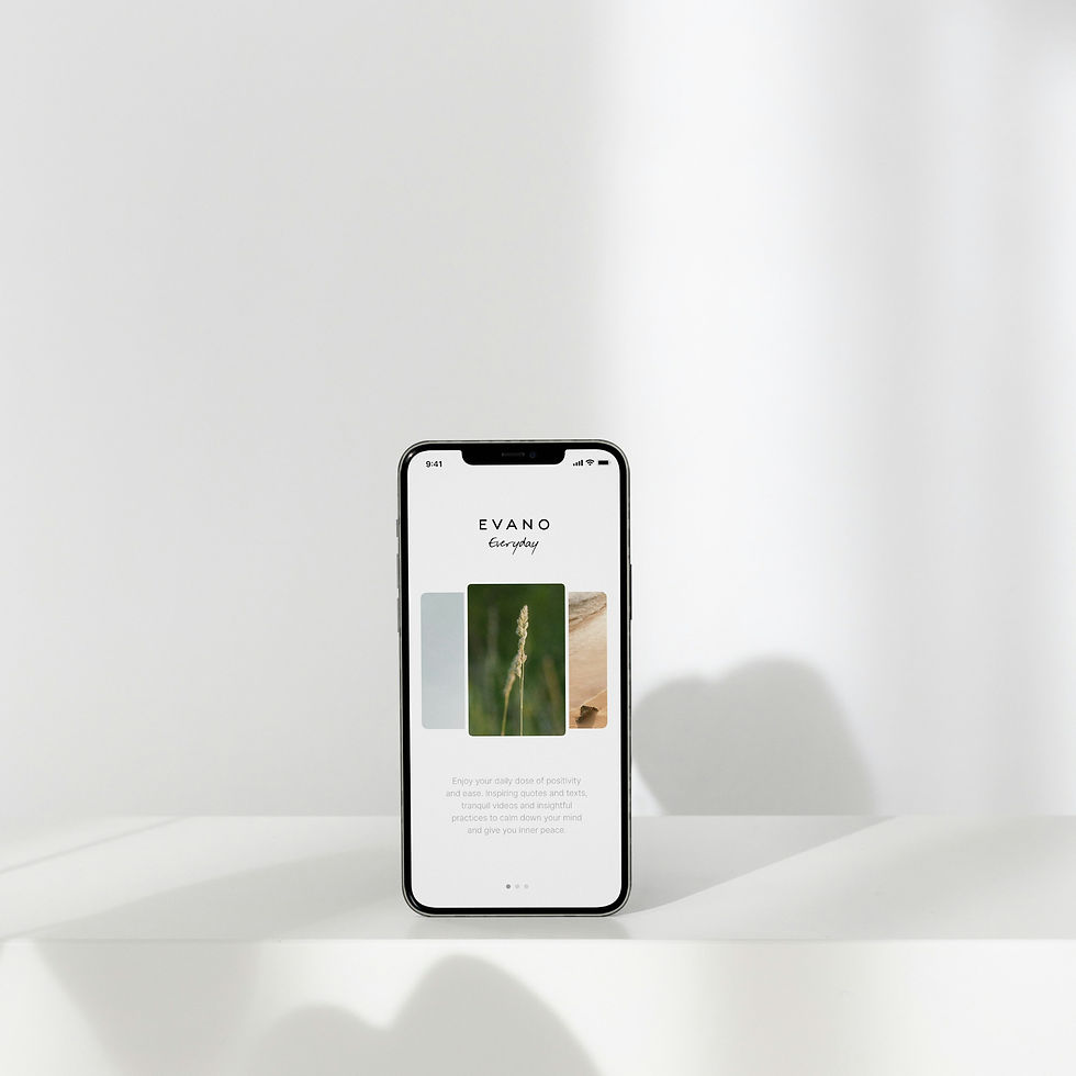
Responsive web design is an approach to web design for women entrepreneurs that allows your website to automatically adjust its layout, images, and content based on the device being used. Instead of creating separate versions of your site for mobile and desktop, responsive design uses flexible grids, fluid images, and CSS media queries to deliver a cohesive experience across all platforms.
According to Statista, over 60% of global website traffic now comes from mobile devices. If your website isn't optimized for mobile, you're likely losing potential clients before they even have a chance to learn about your services.
For business owners focused on marketing for women owned businesses, responsive design is a non-negotiable. It ensures every visitor, no matter how they access your site, experiences a refined, professional, and user-friendly interface that reflects your brand's quality.
Why Responsive Web Design Matters for Women Entrepreneurs
As a woman entrepreneur, your website is more than just a digital placeholder. It's your brand's home, your marketing hub, and often your most powerful tool for growth. Here's why responsive design is critical for women owned businesses:
Improved User Experience
A responsive website delivers a seamless experience across all devices. Visitors can easily navigate your site, read your content, and take action without frustrating pinch-and-zoom gestures or horizontal scrolling. This polished user experience builds trust and keeps potential clients engaged.
Better SEO Performance
Google prioritizes mobile-friendly websites in search rankings. In fact, Google's mobile-first indexing means the search engine primarily uses the mobile version of your site for ranking and indexing. Without responsive design, your branding and SEO efforts may fall short, limiting your national visibility.
Higher Conversion Rates
When your website looks and functions beautifully on every device, visitors are more likely to convert. Whether they're booking a consultation, signing up for your email list, or purchasing a service, a responsive design removes friction from the customer journey. For women entrepreneurs focused on elevated marketing, this translates to real business growth.
Cost and Time Efficiency
Rather than managing separate desktop and mobile sites, responsive design consolidates your efforts into one cohesive platform. This saves time, reduces maintenance costs, and ensures consistent branding for women entrepreneurs across all touchpoints.
Ready to elevate your website with responsive design? Contact Studio Holder today to create a site that works as hard as you do.
Key Elements of Responsive Web Design
Creating a truly responsive website requires attention to several key design and technical elements. Here's what goes into building an elevated website that adapts beautifully to any screen:
Flexible Grid Layouts
Responsive design uses flexible grids that proportion elements relative to screen size rather than fixed pixel measurements. This ensures your content rearranges and resizes gracefully on any device.
Fluid Images and Media
Images and videos scale proportionally within their containers, preventing oversized visuals from breaking your layout on smaller screens. This is essential for maintaining a polished, professional appearance.
CSS Media Queries
Media queries allow your website to apply different styles based on device characteristics like screen width, orientation, and resolution. This technical foundation enables your site to deliver device-specific experiences without duplicating content.
Touch-Friendly Navigation
On mobile devices, navigation needs to be intuitive and easy to use with a finger rather than a mouse. Responsive design incorporates larger buttons, simplified menus, and touch-optimized interactions.
Fast Loading Times
Responsive websites are optimized for performance across all devices. According to Google's research, 53% of mobile users abandon sites that take longer than three seconds to load. For marketing for women entrepreneurs, speed is a competitive advantage.
How Responsive Design Supports Your Marketing Strategy
Responsive web design isn't just a technical feature. It's a strategic investment in your business and marketing strategy. Here's how it supports your broader marketing goals:
Responsive Websites Create A Unified Brand Experience
A responsive website ensures your brand looks consistent and elevated across every device. Whether a potential client discovers you on their phone during a morning commute or researches you on a desktop later, they'll experience the same cohesive branding for female entrepreneurs.
Responsive Websites Provide Enhanced Social Media Integration
Most social media traffic comes from mobile devices. When you share a blog post or service page on Instagram, Facebook, or LinkedIn, responsive design ensures visitors land on a site that's optimized for their device. This seamless experience increases engagement and conversions.
Responsive Websites Allow For Better Analytics and Insights
Managing one responsive site instead of separate desktop and mobile versions simplifies your analytics. You'll gain clearer insights into user behavior, allowing you to refine your marketing strategy for entrepreneurs with accurate data.
Responsive Websites Give Women Entrepreneurs A Competitive Advantage
While many businesses still struggle with outdated, non-responsive websites, investing in modern website design and marketing services positions you as a professional, forward-thinking leader in your industry. For women owned businesses competing for national visibility, this distinction matters.
The Connection Between Responsive Design, Branding, and SEO
At Studio Holder, we believe that effective branding and marketing services integrate design, strategy, and search optimization. Responsive web design is where these elements converge.
Responsive Design Elevates Your Brand
Your website is a visual representation of your brand identity. A responsive design ensures that your carefully crafted branding for women entrepreneurs translates beautifully across all devices, reinforcing your professionalism and attention to detail.
Responsive Design Boosts SEO
As mentioned earlier, Google rewards mobile-friendly sites with higher search rankings. When you combine responsive design with strategic SEO services, you create a powerful foundation for organic visibility. Your site becomes easier to find, easier to navigate, and easier to convert.
Responsive Design Supports Long-Term Growth
A responsive website isn't just a short-term fix. It's a scalable solution that grows with your business. As you add new services, publish blog content, or expand your offerings, your responsive site adapts without requiring a complete redesign. This flexibility supports sustainable marketing and entrepreneurship strategies.
Want to integrate responsive design with a comprehensive marketing strategy? Explore our services and discover how we help women entrepreneurs build cohesive, elevated brands.
How to Know If Your Website Needs a Responsive Redesign
Not sure if your current website is truly responsive? Here are some signs it might be time for an upgrade:
Poor mobile experience: If visitors need to pinch, zoom, or scroll horizontally to view your content, your site isn't responsive.
High bounce rates on mobile: Check your analytics. If mobile visitors leave quickly, your site may be frustrating to use.
Declining search rankings: If your SEO performance has dropped, especially on mobile searches, a non-responsive design could be the culprit.
Outdated design: If your site looks dated or doesn't reflect your current brand identity, a responsive redesign can modernize your online presence.
Difficult navigation: If users struggle to find information or complete actions on smaller screens, it's time for a responsive overhaul.
Investing in responsive web design for women entrepreneurs is an investment in your business's credibility, visibility, and growth. At Studio Holder, we specialize in creating elevated, responsive websites that reflect your unique brand and support your long-term goals.
Ready to transform your website into a responsive, conversion-focused asset? Get in touch with Studio Holder and let's elevate your online presence together.
Frequently Asked Questions About Responsive Web Design
What is the difference between responsive and mobile-friendly design?
Mobile-friendly design typically refers to a simplified version of a website optimized for mobile devices, often as a separate site. Responsive web design, on the other hand, uses a single site that adapts fluidly to any screen size. Responsive design is more efficient, provides a better user experience, and is preferred by search engines like Google.
How does responsive web design impact SEO?
Responsive web design directly impacts SEO by improving user experience, reducing bounce rates, and meeting Google's mobile-first indexing requirements. A responsive site is easier for search engines to crawl and index, which can lead to higher rankings and increased visibility for women owned businesses seeking national reach.
Is responsive design enough, or do I also need a mobile app?
For most women entrepreneurs and small business owners, a responsive website is sufficient. Mobile apps are typically necessary only for businesses that require offline functionality, frequent user interaction, or app-specific features. A well-designed responsive site combined with strategic SEO and marketing support will serve most businesses effectively.
How long does it take to create a responsive website?
The timeline for building a responsive website depends on the complexity and scope of the project. A basic responsive site may take 4 to 6 weeks, while more comprehensive projects with custom features, branding integration, and content creation can take 8 to 12 weeks or longer. Working with a women owned marketing agency like Studio Holder ensures a streamlined, strategic process.
Can my existing website be made responsive, or do I need to start from scratch?
In many cases, an existing website can be retrofitted with responsive design elements. However, if your site is built on outdated technology or has significant structural issues, a complete redesign may be more cost-effective and deliver better long-term results. A professional evaluation from a web design and marketing partner can help you determine the best path forward.
What is the cost of responsive web design?
The cost of responsive web design varies based on the size, complexity, and customization of your project. At Studio Holder, we offer tiered website design packages to fit different needs and budgets, from essential sites for new entrepreneurs to comprehensive designs for established women owned businesses. Investing in quality responsive design pays dividends through improved user experience, better SEO performance, and higher conversion rates.

About Kimberly Holder, Founder & CEO
Kimberly Holder is the Founder & CEO of Studio Holder, a boutique marketing and web design studio serving women-led businesses. With over a decade of experience in marketing and public relations, and thirteen years as an entrepreneur herself, Kimberly blends strategy, creativity, and empathy to help women grow brands that feel as elevated as they are effective.
When she’s not crafting marketing strategies, Kimberly is spending time with her husband, children, and cats, traveling, shopping, or cooking something new in the kitchen.


Comments